Looka review
The Artist Formerly Known as Logojoy
Looka. Is that pronounced like “look-a” or “luke-a”? It’s one of the great mysteries of the last five minutes or so. Other mysteries include:
- Will Looka give me the logo I want?
- Is the price really worth it?
- Should I have another coffee already? It’s so early in the day.
Well, it’s always the right time for coffee. As for the logos…
Logojoy established itself as a player in the logo generator landscape in only a few years. In was recently rebranded, and reborn with a new name and a new destiny. It would be called, you guessed it, “Looka.”
The real difference was that it added a bunch of add-on services (more on that later) to the logo generator.
Looka and its add-ons are available in English, English, and also in English. The actual logo maker seems to only support Latin characters, but it does include things like accent marks, so at least you’re not limited to a simple English-language company name.
It promises to give you a great looking logo in minutes, which is a bold claim to make.
I’m testing all the big logo design platforms on my quest to find the best new logo for Website Planet. Let’s see how Looka did.
FEATURES
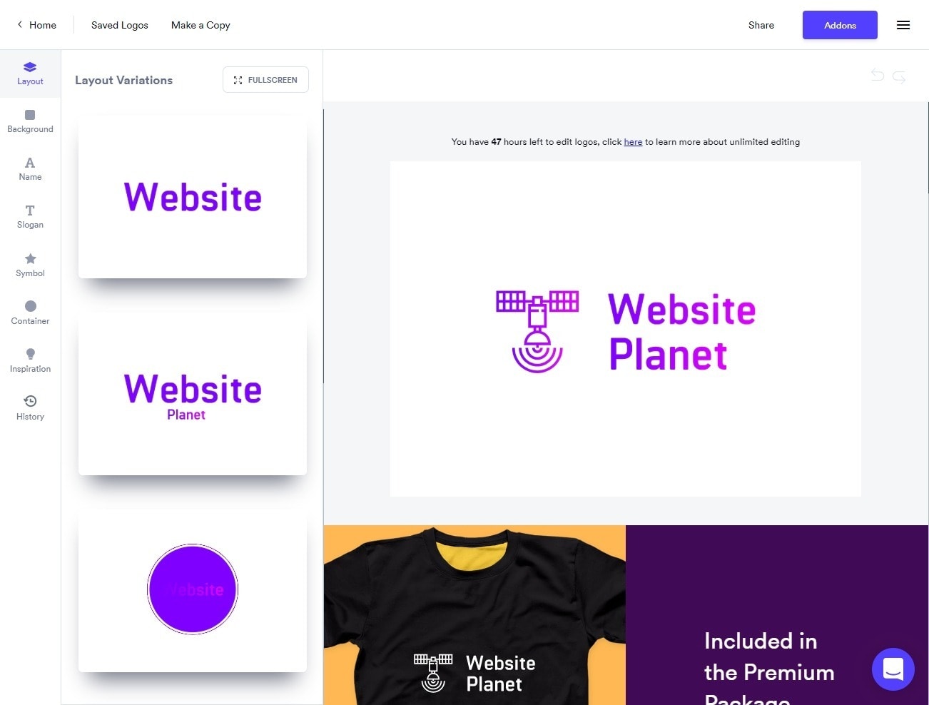
The Features Are Somewhat Limited (On Purpose)
The entire point of Looka, as stated by its marketing, is to get you going with a logo in minutes. Now, if you’re picky like me, it can take a bit longer, and then you have to edit out the half of your review video that you spent just mindlessly looking for an icon that stood out to you.
I have very relatable problems, I tell ya!
But mostly, Looka can and will live up to that claim. The step-by-step wizard is fast, and it’s simple to change your layout, your icon, background shapes, and the overall style. Once you’ve answered the most basic questions about what kind of logo you want, the artificial intelligence will do its thing. You can just keep clicking Generate until you find a logo that you like.
But how relevant are these AI-generated logos? Well… you know that one kid in class who would always raise their hand, whether they had the answer or not, and got it right about half the time? The logo results are like that. You’re going to find options that fit the requirements you provided, and you’re also going to see logos that make you wonder why they showed up at all.
Once you’ve chosen a base logo to edit, you can customize pretty much everything: the typefaces, the icon, the colors. There are gradients as well, but while you can pick custom colors, the gradient options are limited.
Looka’s limitations come into play with size and positioning. You can choose your base layout and you can change the font and icon size to a degree, but those degrees are limited, and you can’t drag and drop things wherever you want. Size and positioning are managed by sliders, and everything is positioned in relation to your chosen layout and the other part of your logo.
These constraints make it hard to get exactly what you want if you have very particular layout ideas. However, these constraints are a deliberate choice, and not necessarily a bad thing. I’ll explain why down below.
In the meantime, there isn’t a functional character limit for the name or taglines, though as usual, that can cause some logistical issues. Specifically, too many characters in your company name will make the whole thing rather hard to read:
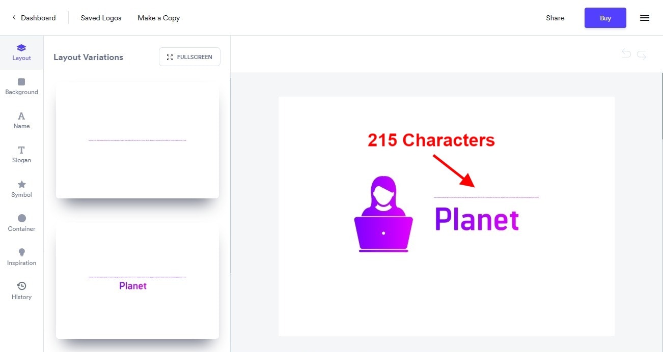
The tools given don’t allow you to generate the most unique logos out there, but they will still look pretty good.
With the Basic plan, your good-looking logo comes with one lonely PNG file. The Premium plan comes with SVG, EPS, and PDF formats, so you can have scalable versions of your logo, as well as files ready for printing.
Looka Has Great-Looking Logos by Default
The layouts are fairly standard and a lot of the icons are exactly the same as the ones available in Wix Logo Maker.
But somehow, the logos on Looka just look good, even elegant in comparison to those of other logo generators.
Why is that? In part, it’s their font and color selection. Another big factor, though, is spacing and proportions. You see, good design and layout can happen in two ways:
- You can just mess around, and keep going until you have something that looks amazing. This usually takes a while.
- You can do the math. Unfortunately, this takes a lot longer for me, because math is not my friend.
The designers at Looka have done the math, and that math is applied to every logo it generates. They’re not all perfect, but they follow a (literal) formula that makes most of them look darned good.
This is also why it has constraints on the layout and positioning of elements; it’s trying very hard to make sure you have at least a decent-looking logo, no matter what you do in the editor. Basically, it’s trying to make it impossible for non-designers to mess up.
That might sound patronizing, but designers and developers (try to) do this all the time. Now they’re just using software to do it for them. When your goal is to generate appealing logos as fast as possible, sacrificing the flexibility of the logo editor for quality is actually a smart move.
It Has Some Great Add-ons
Well, it wouldn’t be a logo design generator if it didn’t try to upsell you a little bit. Looka has a website builder, business card designs, and an optional social media kit that comes with your logo in all the image sizes needed for different social media networks.
Standard stuff, but useful all the same.
You Get Semi-Unlimited Revisions
This is something I particularly liked: for 72 hours after you buy your logo, you can edit it an unlimited amount of times. Would it be nice to be able to do this forever? Well yes, but 72 hours of free revisions is 72 hours more than I’ve seen from any other logo generator so far.
You Can Hire a Professional
One add-on I didn’t mention earlier is that you can hire a professional designer to work on your logo for an hour. This service is meant to circumvent the constraints of the software, so if you want a very specific sort of layout, a gradient not provided by the logo editor, or any other sort of simple change that can be done in an hour, this service is here for you.
My Experience with Looka
Well, you can see most of it in the video above. Follow the wizard, find the right icon, make the base logo. I spent a considerable amount of time experimenting to get exactly the logo I wanted, running into those previously mentioned constraints on the logo editor and working around them.
Honestly, I want just one logo maker to let me put one word above another without using the “tagline” option. Also, I had to tether my phone to my PC to get the logo editor to, well… load half the time. It’s not slow-connection-friendly, which can be a major problem. I’m in the greater metropolitan area of Mexico City, and it’s a problem for me.
Otherwise, it’s a pretty good service. Here’s the final logo I purchased:

EASE OF USE
It’s Mostly Self-Explanatory
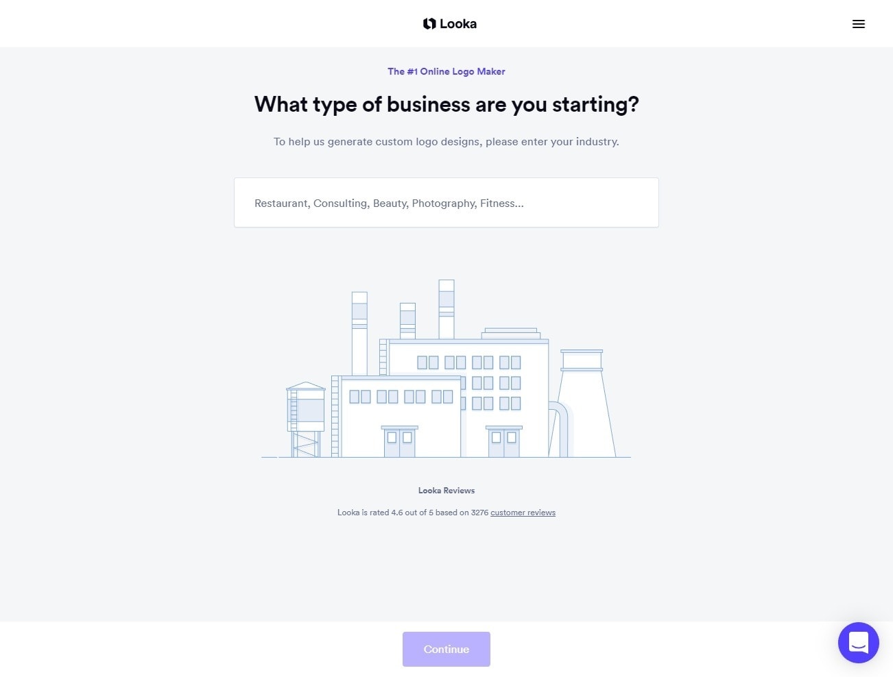
One of the good things you can say about software that has a specific focus, and some constraints, is that it will never be too complex. You type in your logo name, click a few buttons that are clearly labeled and Looka gives you logos. You’d have a harder time ordering coffee at a coffee shop that has decided to use Italian names for everything.
The point is that Looka won’t be too hard to figure out, even if you’ve never used one of these services before. The Wizard asks good questions, but not too many of them. The editor is mostly easy to use, though certain functions, like the advanced color picker, aren’t as clearly labeled as they should be.
If you make any mistakes, there’s a robust and useful “undo” function, as well as a simple “history” panel that keeps track of your logo iterations. Besides, you don’t even have to sign up to try the whole thing out. In addition…
You Can Save Your Projects before You Pay
I feel very, very strongly about this, which is why I take the time to write about this feature in every review. This feature is essential, and Looka has it. In fact, it makes it very easy to save variations of your logo as you work on/refine it, so if you’re picky like me, it’s a useful feature.
It Provides Plenty of Design Inspiration
If you’re stuck figuring out what you want, the editor has a panel full of design inspiration and example logos to browse. The editor is designed to encourage you to experiment, and if you don’t like what you’ve made so far, you can click a different logo design to change… pretty much everything about your existing logo.
You Can Search the Knowledge Base on Any Page
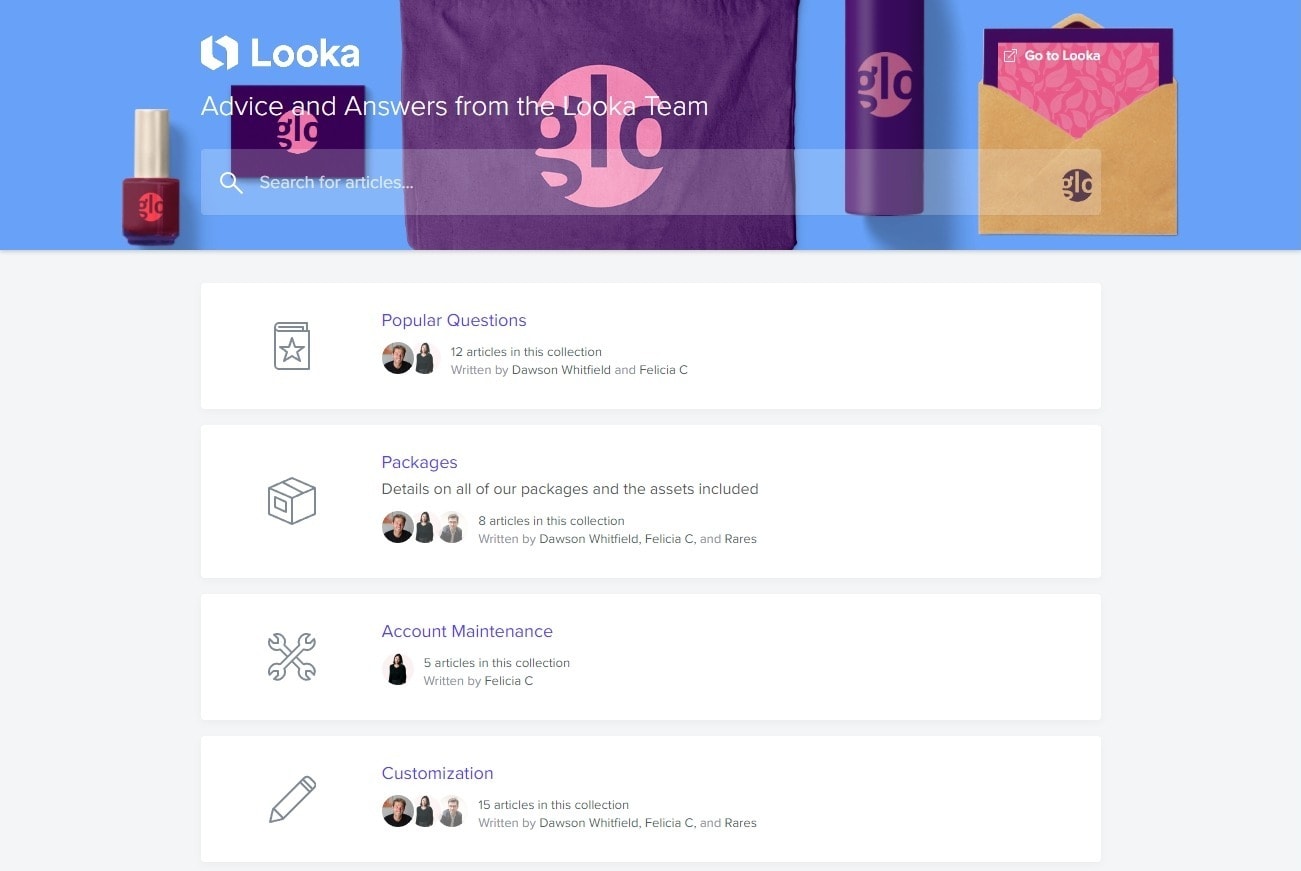
So yeah, there’s a knowledge base, and you can search it from the little “Help” window in the bottom-right corner of every page and screen. There’s a Help Center (more on that later) but you can find answers to your most common questions and issues without even leaving the editor.
SUPPORT
The Live Chat Could Be Better
If you miss the good old days of IRC, ICQ, AIM, MSN, or Yahoo messenger (depending on how old/nerdy you are), then you’re in luck. There doesn’t appear to be any way to phone the Looka team, but you can email them… and enter a chat conversation. What I mean is that its support email address is tied directly to its chat system, so you can use either and you’ll be talking to the same people.
As I said, there is a Help Center/knowledge base which you can browse, or use that aforementioned little help window that also houses the chat. If you ask a question, and customer service doesn’t get back to you immediately, there’s a chatbot that will automatically search its knowledge base for the most relevant articles.
The live chat is not 24/7. According to Looka, the service runs from “9 AM – 9 PM GMT -5 (that’s EST if you live in North America) with the fastest response times between 10 AM – 5 PM.” That’s a respectable 12-hour window. Here’s how it went for me:
First, I asked whether there was a way to view my invoice on the site itself. Yes, there is.
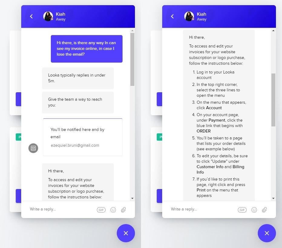
I got a canned response to my first questions
Then, I asked what intellectual and ownership rights you get for the Basic plan. All of them, as it turns out:

When I asked my second question, they told me I had to wait till the next day and sent me links to articles. It took a while to get a real response from a human.
Then, I asked if there was an email I could use to contact them. I made the mistake of asking after the support team had closed up shop, and then I found the relevant info in the knowledge base. Whoops. I suspect they’ll be very nice about it when they get back to me.
Update: They never got back to me, which is fair in this case.
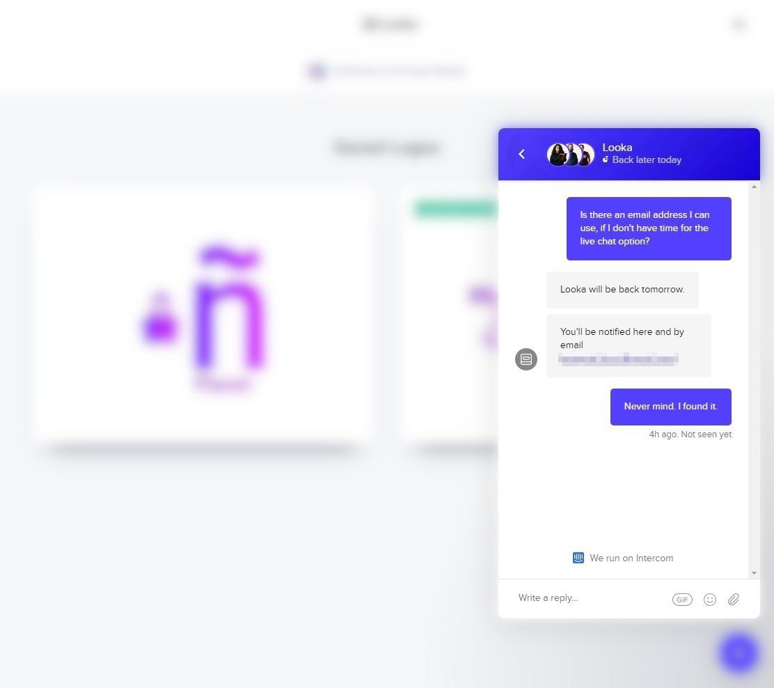
Every question I asked during their schedule was answered in less than five minutes.
PRICING
Overall, the pricing is quite affordable. The Basic plan, as mentioned, gets you that one PNG. The Premium plan gives you a bunch of other file formats, lifetime technical support, and a miniature brand guide with information on your fonts and colors. The Enterprise plan comes with all of that, and the Social Media Kit and Business Card add-ons.
If you choose Looka Logo Maker, I’d strongly suggest getting at least the Premium plan for the extra file formats and the scalable formats in particular. And no, scalable logos aren’t just for printing billboards: they’re also for 4K video and the newer iPhone models with their darned Retina screens.
(For the less-technical, Retina screens basically need images that are twice as big to look good, because Apple wants us to waste all of our bandwidth.)
Anyway, Looka is not expensive. If you decide to go with it, you can pay its low prices with:
- American Express
- MasterCard
- Visa
- PayPal
There are no free logo samples and no refunds.
Usage Rights
Okay, the marketing on this site is a little tricky: the Premium plan advertises “full ownership.” But as mentioned by the support team, all plans (even the Basic plan) provide full ownership for you to use the logo however you like, including commercial applications. This little bit of trickery is the one reason I can’t score Looka’s pricing higher.
Related News
Improv Traffic School Review
Improv Traffic School is a very unique online traffic school course and has been approved inRead More

Comments are Closed